
Table of Contents
In this article, we will demonstrate COVID-19 detection from Chest X-ray (CXR) images using a transfer learning approach with a detailed model interpretation.
This article is divided into the following 10 sections:
- Dataset description
- Exploratory Data Analysis
- Data Loading & Image Pre-processing
- Train Test Split
- Image Normalization
- Image Augmentation
- Model Building
- Model Evaluation
- Sample Prediction
- Model Explanation
1. Dataset description
In this demonstration, we will use the COVID CXR Image Dataset (Research) which consists of a total of 1823 posteroanterior (PA) views of chest X-ray images comprising Normal, Viral, and COVID-19 affected patients. This dataset is also used in the research paper “COVIDLite: A depth-wise separable deep neural network with white balance and CLAHE for detection of COVID-19” which has shown significant results by building a depth-wise separable CNN with a novel image pre-processing technique i.e., a combination of white balance and CLAHE.
The distribution of images in COVID-19, Viral, and Normal patients are shown in Table 1.
| Image Class | #Images |
| COVID-19 | 536 |
| Viral Pneumonia | 619 |
| Normal | 668 |
2. Exploratory Data Analysis
In the dataset, the age range of patients suffering from COVID-19 cases is 18-75 years. The detailed specification of images used in the dataset is shown in Table 2.
| Image Class | Min Width | Max width | Min Height | Max Height |
| Normal | 1040 | 2628 | 650 | 2628 |
| COVID-19 | 240 | 4095 | 237 | 4095 |
| Viral Pneumonia | 384 | 2304 | 127 | 2304 |
As per Table 2, huge variations is observed in the images of the COVID-19 class in terms of minimum, maximum height, minimum width, and maximum width compared to other class of images.
The code for getting the image specification per image class is given below.
#importing important libraries
import tensorflow
from PIL import Image
import glob
from tensorflow.keras.preprocessing.image import ImageDataGenerator,load_img, save_img, img_to_array
from tensorflow.keras.preprocessing import image
from tensorflow.keras import backend as K
from tensorflow.keras.models import Model, Sequential
from tensorflow.keras.layers import Input, Dense, Flatten, Dropout, BatchNormalization,Conv2D, SeparableConv2D, MaxPool2D, LeakyReLU, Activation
from tensorflow.keras.optimizers import Adam
from sklearn.model_selection import train_test_split
from tensorflow.keras.callbacks import ModelCheckpoint, ReduceLROnPlateau,EarlyStopping
from tensorflow.keras.applications.imagenet_utils import preprocess_input
from sklearn.metrics import classification_report,accuracy_score
from sklearn.metrics import confusion_matrix
import matplotlib.pyplot as plt
import numpy as np
from tqdm import tqdm
import cv2
import os
import shutil
import itertools
import imutils
from sklearn.model_selection import StratifiedKFold
import random
from tensorflow.keras import layers
from google.colab import drive


# Loading images from Gdrive and creating directory per class
COV_DIR = "/content/drive/My Drive/COVID_IEEE/covid/"
NORM_DIR = "/content/drive/My Drive/COVID_IEEE/normal/"
VIR_DIR = "/content/drive/My Drive/COVID_IEEE/virus/"

# function for printing image specification
def Images_details_Print_data(data, path):
    print(" ====== Images in: ", path)
    for k, v in data.items():
        print("%s:\t%s" % (k, v))

# function for getting image specification details
def Images_details(path):
    files = [f for f in glob.glob(path + "**/*.*", recursive=True)]
    data = {}
    data['images_count'] = len(files)
    data['min_width'] = 10**100  # No image will be bigger than that
    data['max_width'] = 0
    data['min_height'] = 10**100  # No image will be bigger than that
    data['max_height'] = 0


    for f in files:
        im = Image.open(f)
        width, height = im.size
        data['min_width'] = min(width, data['min_width'])
        data['max_width'] = max(width, data['max_height'])
        data['min_height'] = min(height, data['min_height'])
        data['max_height'] = max(height, data['max_height'])

    Images_details_Print_data(data, path)


# getting specification of Normal images
Images_details(NORM_DIR)

# getting specification of COVID-19 images
Images_details(COV_DIR)

# getting specification of Viralimages
Images_details(VIR_DIR)
Plotting sample images
Next, we will be plotting sample images of each class to understand the visual difference among different classes of images.
# Getting the list of images for each class for future use
Cimages = os.listdir(COV_DIR)
Nimages = os.listdir(NORM_DIR)
Vimages = os.listdir(VIR_DIR)
# plotting sample images of COVID-19
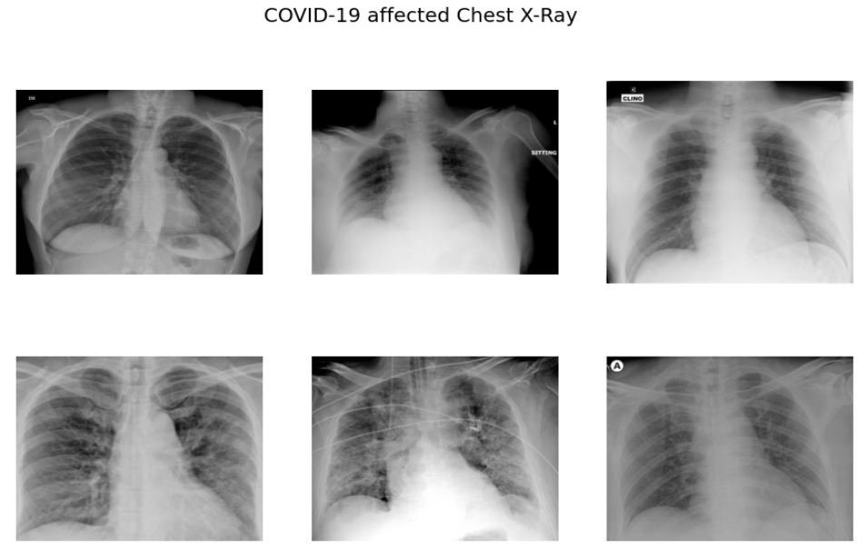
sample_images = random.sample(Cimages,6)
f,ax = plt.subplots(2,3,figsize=(15,9))
for i in range(0,6):
im = cv2.imread('/content/drive/My Drive/COVID_IEEE/covid/'+sample_images[i])
ax[i//3,i%3].imshow(im)
ax[i//3,i%3].axis('off')
f.suptitle('COVID-19 affected Chest X-Ray',fontsize=20)
plt.show()
# plotting sample images of VIRAL cases
sample_vimages = random.sample(Vimages,6)
f,ax = plt.subplots(2,3,figsize=(15,9))

for i in range(0,6):
    im = cv2.imread('/content/drive/My Drive/COVID_IEEE/virus/'+sample_vimages[i])
    ax[i//3,i%3].imshow(im)
    ax[i//3,i%3].axis('off')
f.suptitle('Viral Pneumonia affected Chest X-Ray',fontsize=20)
plt.show()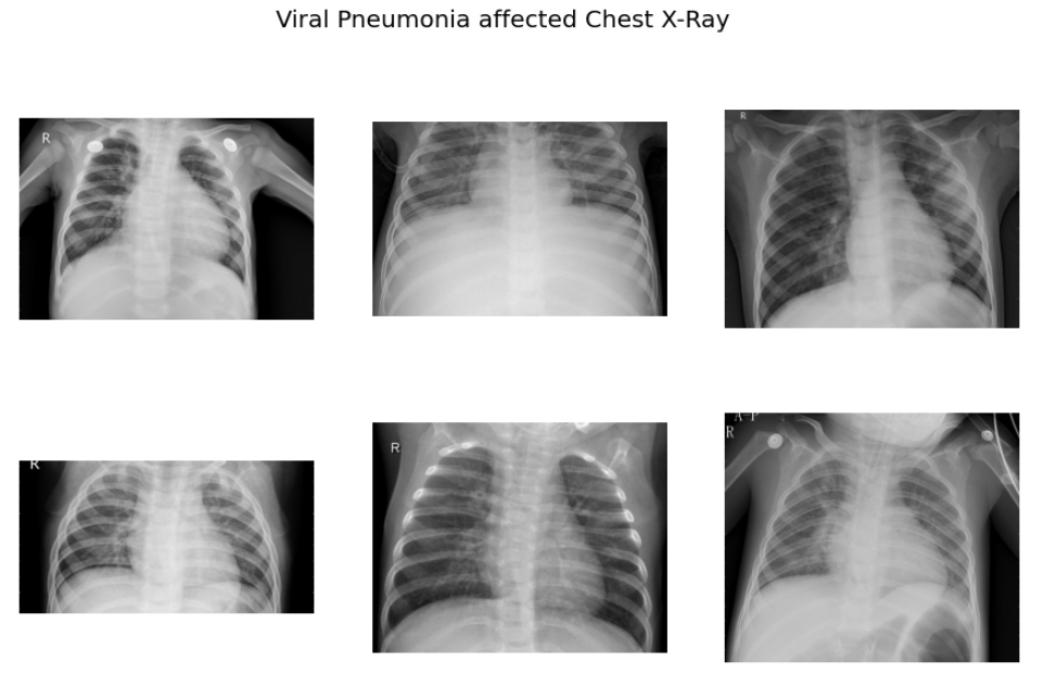
# plotting sample images of COVID-19
sample_nimages = random.sample(Nimages,6)
f,ax = plt.subplots(2,3,figsize=(15,9))

for i in range(0,6):
    im = cv2.imread('/content/drive/My Drive/COVID_IEEE/normal/'+sample_nimages[i])
    ax[i//3,i%3].imshow(im)
    ax[i//3,i%3].axis('off')
f.suptitle('Normal Chest X-Ray',fontsize=20)
plt.show()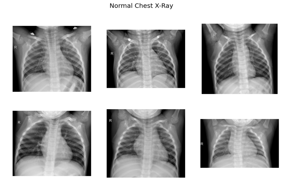
As per the sample images of COVID 19 CXR, it is evident that the normal CXR images have clear lungs without any area of abnormal opacification pattern in the image, viral pneumonia (middle) manifests with a more diffuse ”interstitial” pattern in both left and right lung while COVID-19 CXR images evident of the presence of ground-glass opacification and consolidation in the right upper lobe and left lower lobe.
3. Data Loading & Image pre-processing
In this step, we will be loading the data and performing pre-processing of chest x-ray images so that model can understand the pattern hidden in the image for a particular class. For this use case, we will be using the white balance technique for enhancing the quality of chest x-ray images.
White balance
White balance is an image processing method usually applied over those images which suffered from the problem of low lighting conditions. This problem is common in medical radiology images as sometimes image capturing instruments/devices unable to detect proper light in the image resulting in the image appearing dark. The white balance algorithm adjusts the colors of the active layers of the image by stretching red, green, and blue channels independently. In this case, pixel colors at the end of three channels i.e., RGB are discarded and are only used by 0.05% of the pixels present in the image, while stretching is applied to the rest of the color range.
The detailed steps involved in the white balance algorithm are given below:
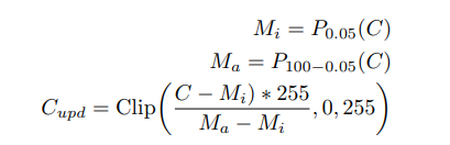
where Pi(C) represents the taking the ith percentile of channel C, and
Clip(., min, max) operation represents saturation operation within the minimum and maximum values. C, Cupd represents the input and updated channels pixel values respectively after applying the operation.
The code for applying white balance to the image is given below.
# Loading Original Image
img = cv2.imread('/content/drive/My Drive/COVID_IEEE/virus/person1661_virus_2872.jpeg')
plt.imshow(img, cmap=plt.cm.bone)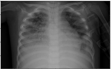
# white balance for every channel independently
def wb(channel, perc = 0.05):
    mi, ma = (np.percentile(channel, perc), np.percentile(channel,100.0-perc))
    channel = np.uint8(np.clip((channel-mi)*255.0/(ma-mi), 0, 255))
    return channel


imWB  = np.dstack([wb(channel, 0.05) for channel in cv2.split(img)] )
# Convert image to grayscale

gray_image = cv2.cvtColor(imWB, cv2.COLOR_BGR2GRAY)
plt.imshow(gray_image, cmap=plt.cm.bone)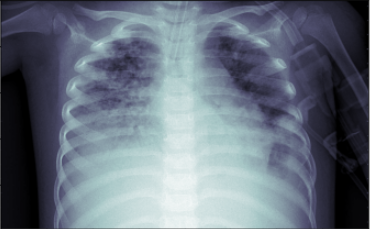
As we can see from the above image after applying the white balance operation, the chest x-ray image is more enhanced in comparison to the original image which will definitely help our CNN model in extracting useful features from the image.
The code for loading data and pre-processing images using white balance is given below:
data=[]
labels=[]
Normal=os.listdir("/content/drive/My Drive/COVID_IEEE/normal/")
for a in Normal:
	# extract the class label from the filename


	# load the image, swap color channels, and resize it to be a fixed
	# 224x224 pixels while ignoring aspect ratio
	image = cv2.imread("/content/drive/My Drive/COVID_IEEE/normal/"+a)
        # performing white balance
	imWB  = np.dstack([wb(channel, 0.05) for channel in cv2.split(image)] )
	gray_image = cv2.cvtColor(imWB, cv2.COLOR_BGR2GRAY)
	img = cv2.cvtColor(gray_image, cv2.COLOR_GRAY2RGB)
	image = cv2.resize(img, (224, 224))

	# update the data and labels lists, respectively
	data.append(image)
	labels.append(0)

Covid=os.listdir("/content/drive/My Drive/COVID_IEEE/covid/")
for b in Covid:
	# extract the class label from the filename


	# load the image, swap color channels, and resize it to be a fixed
	# 224x224 pixels while ignoring aspect ratio
	image = cv2.imread("/content/drive/My Drive/COVID_IEEE/covid/"+b)
        # performing white balance
	imWB  = np.dstack([wb(channel, 0.05) for channel in cv2.split(image)] )
	gray_image = cv2.cvtColor(imWB, cv2.COLOR_BGR2GRAY)


	img = cv2.cvtColor(gray_image, cv2.COLOR_GRAY2RGB)
	image = cv2.resize(img, (224, 224))
	# update the data and labels lists, respectively
	data.append(image)
	labels.append(1)

Virus=os.listdir("/content/drive/My Drive/COVID_IEEE/virus/")
for c in Virus:
	# extract the class label from the filename


	# load the image, swap color channels, and resize it to be a fixed
	# 224x224 pixels while ignoring aspect ratio
	image = cv2.imread("/content/drive/My Drive/COVID_IEEE/virus/"+c)
        # performing white balance
	imWB  = np.dstack([wb(channel, 0.05) for channel in cv2.split(image)] )
	gray_image = cv2.cvtColor(imWB, cv2.COLOR_BGR2GRAY)

	img = cv2.cvtColor(gray_image, cv2.COLOR_GRAY2RGB)
	image = cv2.resize(img, (224, 224))

	# update the data and labels lists, respectively
	data.append(image)
	labels.append(2)
From the code above, after loading the images we are applying a white balance operation followed by image resizing to size (224,224). Further, we are creating label values 0,1, and 2 for classes Normal, COVID-19, and Viral Infection respectively.
In the next step, we will convert images into NumPy arrays and save them for later reuse as loading Numpy arrays are much faster in comparison to image data.
#converting features and labels in array
feats=np.array(data)
labels=np.array(labels)

# saving features and labels for later re-use
np.save("/content/drive/My Drive/COVID_IEEE/feats_train",feats)
np.save("/content/drive/My Drive/COVID_IEEE/labels_train",labels)
Loading images from Numpy arrays
Now, after saving images we can easily load the images from NumPy arrays, and then we will randomize the images so that they can not maintain any order during the training of the CNN model as it affects the performance of the model. So randomizing data is a very important step in deep learning problems.
# loading images
feats=np.load("/content/drive/My Drive/COVID_IEEE/feats_train.npy")
labels=np.load("/content/drive/My Drive/COVID_IEEE/labels_train.npy")

# randomizing the order of image and labels data
s=np.arange(feats.shape[0])
np.random.shuffle(s)
feats=feats[s]
labels=labels[s]

# retaining length of the data and number of classes
num_classes=len(np.unique(labels))
len_data=len(feats)
print(len_data)
4. Train Test Split
In this step, we will divide our data into training and test sets in the ratio of 80:20 i.e., 80% of the data will be used for training, and the rest 20% will be used for evaluating the model.
# splitting cells images into 80:20 ratio i.e., 80% for training and 20% for testing purpose
(x_train,x_test)=feats[(int)(0.2*len_data):],feats[:(int)(0.2*len_data)]

(y_train,y_test)=labels[(int)(0.2*len_data):],labels[:(int)(0.2*len_data)]
5. Image Normalization
In this step, we will normalize the data by dividing them by 255 so that the data would be in the range of 0 to 1. The reason for doing so is that if we pass colored images with three channels i.e., R, G, B directly to our CNN model results in a highly computational task, and convergence of loss function to global optima also takes too much time. Reducing the image data in the range of (0,1) results in much easier and faster computation and model convergence also takes relatively very less time.
x_train = x_train.astype('float32')/255 # As we are working on image data we are normalizing data by dividing 255.
x_test = x_test.astype('float32')/255
train_len=len(x_train)
test_len=len(x_test)
Next, we have to do target encoding and for this, we have to use the to_categorical method available in keras.utils. As we have three classes so we have to pass 3 as a parameter in this method.
y_train=to_categorical(y_train,3)
y_test=to_categorical(y_test,3)
6. Image Augmentation
In this step, we will augment the image for increasing the training data for building a more robust model. In image augmentation, we generally do certain transformations in the training image so that it will introduce some noise which will help in building a more robust model. In this project, we will be applying only three transformations i.e., rotation range, horizontal_flip, and fill_mode. The reason for using only two transformations is that we have also tried other transformations i.e., zoom_range, shear_range, brightness_level but it resulted in lower model performance in comparison to only two transformations.
trainAug  = ImageDataGenerator(
	rotation_range=15,

	horizontal_flip=True,
	fill_mode="nearest")

# demo augmentation
# set the paramters we want to change randomly

os.mkdir('preview_1')
x = x_train[1]
x = x.reshape((1,) + x.shape)

i = 0
for batch in trainAug.flow(x, batch_size=1, save_to_dir='preview_1', save_prefix='aug_img', save_format='jpg'):
    i += 1
    if i > 30:
        break

plt.imshow(x_train[1])
plt.xticks([])
plt.yticks([])
plt.title('Original Image')
plt.show()

plt.figure(figsize=(15,6))
i = 1
for img in os.listdir('preview_1/'):
    img = cv2.cv2.imread('preview_1/' + img)
    img = cv2.cvtColor(img, cv2.COLOR_BGR2RGB)
    plt.subplot(3,7,i)
    plt.imshow(img)
    plt.xticks([])
    plt.yticks([])
    i += 1
    if i > 3*7:
        break
plt.suptitle('Augemented Images')
plt.show()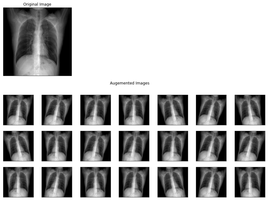
The above image represents the output images of different augmentations applied to a viral pneumonia image from the training set.
7. Model building
In this step, we will finetune the transfer learning model i.e., MobileNet V2 for our problem statement is to classify CXR images into COVID, Viral and Normal images.
The main reason for using the MobileNet model is that it is useful for mobile and embedded vision applications as it has the following two features:
- Smaller model size: Lesser number of parameters
- Smaller complexity: Significantly reduced Multiplications and Additions (Multi-Adds)
So, first, we will download the MobileNet V2 model with imagenet weights.
from tensorflow.keras.applications.mobilenet_v2 import MobileNetV2
conv_base = MobileNetV2(
    include_top=False,
    input_shape=(224, 224, 3),
    weights='imagenet')

for layer in conv_base.layers:
    layer.trainable = True
So, as we can observe the code we are only making the base layers trainable while the top layers as trainable top i.e., we will be utilizing the basic image classification capability of the Mobilenet V2 model which is trained on imagenet dataset.
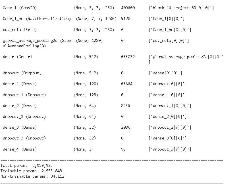
Next, we will add additional layers for customizing the model for our task.
x = conv_base.output
x = layers.GlobalAveragePooling2D()(x)
x = Dense(units=512, activation='relu')(x)
x = Dropout(rate=0.7)(x)
x = Dense(units=128, activation='relu')(x)
x = Dropout(rate=0.5)(x)
x = Dense(units=64, activation='relu')(x)
x = Dropout(rate=0.3)(x)
x = Dense(units=32, activation='relu')(x)
x = Dropout(rate=0.3)(x)
predictions = layers.Dense(3, activation='softmax')(x)
model = Model(conv_base.input, predictions)
model.summary()
After creating the model we have to compile the model by setting up the optimizer which brings non-linearity to the model, loss functions, and the metric for scoring the model. In our case, we will be using Adam optimizer because it combines the advantages of two other extensions of stochastic gradient descent. Specifically:
- Adaptive Gradient Algorithm (AdaGrad) It maintains a per-parameter learning rate that improves performance on problems with sparse gradients (e.g. natural language and computer vision problems).
- Root Mean Square Propagation (RMSProp) It also maintains per-parameter learning rates that are adapted based on the average of recent magnitudes of the gradients for the weight (e.g. how quickly it is changing). This means the algorithm does well on online and non-stationary problems (e.g. noisy).
The loss function will be using categorical_crossentropy as we have more than 2 classes to classify. The metric function “accuracy” will be used is to evaluate the performance of our model. This metric function is similar to the loss function, except that the results from the metric evaluation are not used when training the model (only for evaluation).
model.compile(loss='categorical_crossentropy', optimizer='adam', metrics=['accuracy'])

# setting call back function
callbacks = [ModelCheckpoint('.mdl_wts_mobilenetv2.hdf5', monitor='val_loss',mode='min',verbose=1, save_best_only=True),
             ReduceLROnPlateau(monitor='val_loss', factor=0.3, patience=2, verbose=1, mode='min', min_lr=0.00000000001)]
As we can see from the code above we are also using callbacks. A callback is used to perform actions at various stages of training (e.g. at the start or end of an epoch, before or after a single batch, etc).
We can use callbacks for multiple tasks during training i.e., periodically saving the best weights of the model to disk, so early stopping, penalizing the model by reducing the learning rate, etc. In our case, we are saving the model weights into the disk for a minimum value of validation loss, and for that, we are using Modelcheckpoint. Further, we are also using ReduceLROnPlateau for reducing the learning rate of the model by a factor of 0.3 if its validation loss doesn’t improve for 2 consecutive epochs.
Model fitting
In this step, we will actually fit the model for performing training of the model. For training the model, we are using a batch size of 16 and a number of epochs of 50.
# batch size
BS = 16
print("[INFO] training head...")
H = model.fit(
trainAug.flow(x_train,y_train, batch_size=BS),
steps_per_epoch=train_len // BS,
validation_data=(x_test, y_test),
validation_steps=test_len // BS,
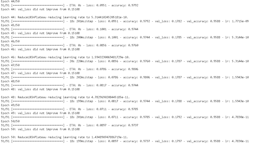
epochs=50,callbacks=callbacks)The result of the model training for 50 epochs is shown below.
8. Model Evaluation
After training our model we will be checking the overall training history of our model. the code for plotting model history is shared below.
acc = H.history['accuracy']
val_acc = H.history['val_accuracy']
loss = H.history['loss']
val_loss = H.history['val_loss']
epochs_range = range(1, len(H.epoch) + 1)

plt.figure(figsize=(15,5))

plt.subplot(1, 2, 1)
plt.plot(epochs_range, acc, label='Train Set')
plt.plot(epochs_range, val_acc, label='Val Set')
plt.legend(loc="best")
plt.xlabel('Epochs')
plt.ylabel('Accuracy')
plt.title('MobileNetV2 Model Accuracy')

plt.subplot(1, 2, 2)
plt.plot(epochs_range, loss, label='Train Set')
plt.plot(epochs_range, val_loss, label='Val Set')
plt.legend(loc="best")
plt.xlabel('Epochs')
plt.ylabel('Loss')
plt.title('MobileNetV2 Model Loss')

plt.tight_layout()
plt.show()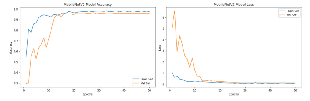
As we can see from the above plots, the model’s validation accuracy and validation loss stabilized after 20 epochs to over 90%.
Next, we will load the best weights of the model with minimum validation loss for evaluating its accuracy and other performance metrics.
model = load_model('.mdl_wts_mobilenetv2.hdf5')
model.save('/content/drive/My Drive/COVID_IEEE/model_v1.h5')

model = load_model('/content/drive/My Drive/COVID_IEEE/model_v1.h5')
# checking the accuracy
accuracy = model.evaluate(x_test, y_test, verbose=1)
print('\n', 'Test_Accuracy:-', accuracy[1])
So our model’s accuracy on the test set is 95.60% which is pretty decent on such a complex dataset. We can always improve our model by finetuning the hyperparameters i.e., batch size, number of epochs, optimizers, etc.
Next, we will plot the confusion matrix and calculate the classification report to understand the class-wise performance of the model.
The code for plotting confusion matrix for multi-class models is shared below:
def plot_confusion_matrix(cm, classes,
                          normalize=False,
                          title='Confusion matrix',
                          cmap=plt.cm.Blues):
    """
    This function prints and plots the confusion matrix.
    Normalization can be applied by setting `normalize=True`.
    """
    plt.imshow(cm, interpolation='nearest', cmap=cmap)
    plt.title(title)
    plt.colorbar()
    tick_marks = np.arange(len(classes))
    plt.xticks(tick_marks, classes, rotation=45)
    plt.yticks(tick_marks, classes)

    target_names =['Normal','COVID-19','Viral']

    if target_names is not None:
        tick_marks = np.arange(len(target_names))
        plt.xticks(tick_marks, target_names, rotation=45)
        plt.yticks(tick_marks, target_names)

    if normalize:
        cm = cm.astype('float') / cm.sum(axis=1)[:, np.newaxis]

    thresh = cm.max() / 2.
    for i, j in itertools.product(range(cm.shape[0]), range(cm.shape[1])):
        plt.text(j, i, cm[i, j],
                 horizontalalignment="center",
                 color="white" if cm[i, j] > thresh else "black")

    plt.tight_layout()
    plt.ylabel('True label')
    plt.xlabel('Predicted label')

# Predict the values from the validation dataset
pred_Y = model.predict(x_test, batch_size = 16, verbose = True)
# Convert predictions classes to one hot vectors
Y_pred_classes = np.argmax(pred_Y,axis=1)
# Convert validation observations to one hot vectors
# compute the confusion matrix
rounded_labels=np.argmax(y_test, axis=1)
confusion_mtx = confusion_matrix(rounded_labels, Y_pred_classes)


# plot the confusion matrix
plot_confusion_matrix(confusion_mtx, classes = range(3)) 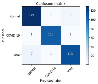
From the confusion matrix above, we can infer that model performed well in detecting COVID-19 cases while it incorrectly predicted some of the viral cases as normal.
The classification report is shared below
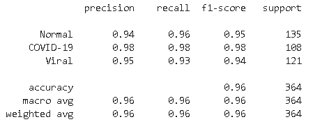
From the classification report, we found that model is highly accurate in predicting COVID-19 bases with a recall of 98% whereas for Normal cases its recall is second highest at 96%. In the case of viral infection image model is confused in some of the images and predicted incorrectly as normal.
Plotting ROC AUC
import seaborn as sns
import pandas as pd
from sklearn.datasets import make_classification
from sklearn.preprocessing import label_binarize
from scipy import interp
from itertools import cycle
import pandas as pd
%matplotlib inline
import numpy as np
import matplotlib.pyplot as plt
from sklearn.metrics import roc_curve, auc


y_test = np.array(y_test)

n_classes = 3

pred_Y = model.predict(x_test, batch_size = 16, verbose = True)
# Plot linewidth.
lw = 2

# Compute ROC curve and ROC area for each class


# Compute ROC curve and ROC area for each class
fpr = dict()
tpr = dict()
roc_auc = dict()
for i in range(n_classes):
    fpr[i], tpr[i], _ = roc_curve(y_test[:, i], pred_Y[:, i])
    roc_auc[i] = auc(fpr[i], tpr[i])
    # Compute micro-average ROC curve and ROC area
fpr["micro"], tpr["micro"], _ = roc_curve(y_test.ravel(), pred_Y.ravel())
roc_auc["micro"] = auc(fpr["micro"], tpr["micro"])
# Plot of a ROC curve for a specific class
for i in range(n_classes):
    plt.figure()
    plt.plot(fpr[i], tpr[i], label='ROC curve (area = %0.2f)' % roc_auc[i])
    plt.plot([0, 1], [0, 1], 'k--')
    plt.xlim([0.0, 1.0])
    plt.ylim([0.0, 1.05])
    plt.xlabel('False Positive Rate')
    plt.ylabel('True Positive Rate')
    plt.title('Receiver operating characteristic example')
    plt.legend(loc="lower right")
    plt.show()

# First aggregate all false positive rates
all_fpr = np.unique(np.concatenate([fpr[i] for i in range(n_classes)]))

# Then interpolate all ROC curves at this points
mean_tpr = np.zeros_like(all_fpr)
for i in range(n_classes):
    mean_tpr += np.interp(all_fpr, fpr[i], tpr[i])

# Finally average it and compute AUC
mean_tpr /= n_classes

fpr["macro"] = all_fpr
tpr["macro"] = mean_tpr
roc_auc["macro"] = auc(fpr["macro"], tpr["macro"])

# Plot all ROC curves
fig = plt.figure(figsize=(12, 8))
plt.plot(fpr["micro"], tpr["micro"],
         label='micro-average ROC curve (area = {0:0.2f})'
               ''.format(roc_auc["micro"]),
         color='deeppink', linestyle=':', linewidth=4)

plt.plot(fpr["macro"], tpr["macro"],
         label='macro-average ROC curve (area = {0:0.2f})'
               ''.format(roc_auc["macro"]),
         color='navy', linestyle=':', linewidth=4)

colors = cycle(['aqua', 'darkorange', 'cornflowerblue'])
for i, color in zip(range(n_classes), colors):
    plt.plot(fpr[i], tpr[i], color=color, lw=lw,
             label='ROC curve of class {0} (area = {1:0.2f})'
             ''.format(i, roc_auc[i]))


plt.plot([0, 1], [0, 1], 'k--', lw=lw)
plt.xlim([0.0, 1.0])
plt.ylim([0.0, 1.05])
plt.xlabel('False Positive Rate')
plt.ylabel('True Positive Rate')
plt.title('Some extension of Receiver operating characteristic to multi-class')
plt.legend(loc="lower right")
sns.despine()
plt.show()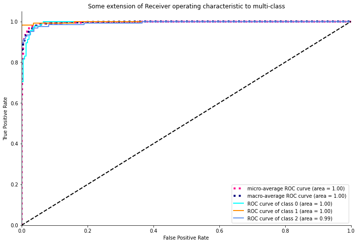
As we can see from the above ROC plot, the model is pretty confident with an ideal AUC value of 1 for both normal and COVID-19 cases whereas it attained an AUC area of 0.99 for viral infection as the model is relatively less accurate in this case.
9. Sample prediction
In this step, we will randomly predict some sample images and see how the model is performing.
y_hat = model.predict(x_test)

# define text labels
cxr_labels = ['Normal','COVID-19','Viral']

# plot a random sample of test images, their predicted labels, and ground truth
fig = plt.figure(figsize=(20, 8))
for i, idx in enumerate(np.random.choice(x_test.shape[0], size=12, replace=False)):
    ax = fig.add_subplot(4,4, i+1, xticks=[], yticks=[])
    ax.imshow(np.squeeze(x_test[idx]))
    pred_idx = np.argmax(y_hat[idx])
    true_idx = np.argmax(y_test[idx])
    ax.set_title("{} ({})".format(cxr_labels[pred_idx], cxr_labels[true_idx]),
                 color=("blue" if pred_idx == true_idx else "orange"))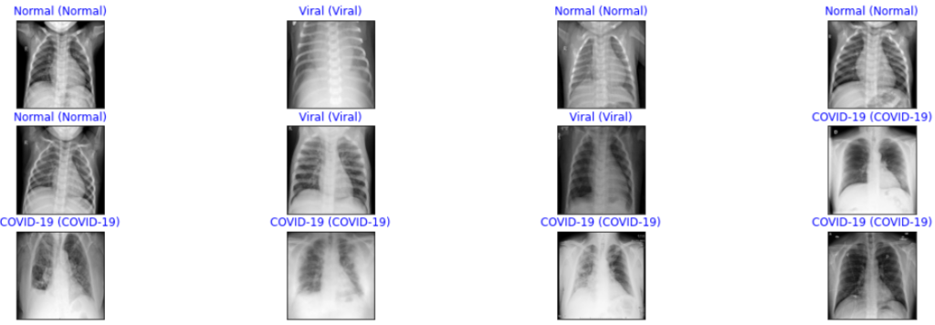
From the above sample predictions, we can observe that it is showing all the correct predictions for all three classes.
10. Model Explanation
In this step, we will interpret the model’s result using the Gradient-weighted Class Activation Mapping (GRAD-CAM) heatmap technique. It uses the gradients flowing in the final convolution layer to plot coarse localization map which highlights specific regions in the target image for predicting the particular image class.
The code for plotting the GRAD-CAM heatmap is shared below:
import tensorflow as tf
def get_img_array(img_path, size):
    # `img` is a PIL image of size 299x299
    img = tf.keras.preprocessing.image.load_img(img_path, target_size=size)
    # `array` is a float32 Numpy array of shape (299, 299, 3)
    array = tf.keras.preprocessing.image.img_to_array(img)
    # We add a dimension to transform our array into a "batch"
    # of size (1, 299, 299, 3)
    array = np.expand_dims(array, axis=0)
    return array


def make_gradcam_heatmap(img_array, model, last_conv_layer_name, pred_index=None):
    # First, we create a model that maps the input image to the activations
    # of the last conv layer as well as the output predictions
    grad_model = tf.keras.models.Model(
        [model.inputs], [model.get_layer(last_conv_layer_name).output, model.output]
    )

    # Then, we compute the gradient of the top predicted class for our input image
    # with respect to the activations of the last conv layer
    with tf.GradientTape() as tape:
        last_conv_layer_output, preds = grad_model(img_array)
        if pred_index is None:
            pred_index = tf.argmax(preds[0])
        class_channel = preds[:, pred_index]

    # This is the gradient of the output neuron (top predicted or chosen)
    # with regard to the output feature map of the last conv layer
    grads = tape.gradient(class_channel, last_conv_layer_output)

    # This is a vector where each entry is the mean intensity of the gradient
    # over a specific feature map channel
    pooled_grads = tf.reduce_mean(grads, axis=(0, 1, 2))

    # We multiply each channel in the feature map array
    # by "how important this channel is" with regard to the top predicted class
    # then sum all the channels to obtain the heatmap class activation
    last_conv_layer_output = last_conv_layer_output[0]
    heatmap = last_conv_layer_output @ pooled_grads[..., tf.newaxis]
    heatmap = tf.squeeze(heatmap)

    # For visualization purpose, we will also normalize the heatmap between 0 & 1
    heatmap = tf.maximum(heatmap, 0) / tf.math.reduce_max(heatmap)
    return heatmap.numpy()

def save_and_display_gradcam(img_path, heatmap, cam_path="cam.jpg", alpha=0.4):
    # Load the original image
    # fname=img_path.split('.')[-1]
    file_name=os.path.basename(img_path)
    img = tf.keras.preprocessing.image.load_img(img_path)
    img = tf.keras.preprocessing.image.img_to_array(img)
    # img = im.open(img_path).resize((224,224)) #target_size must agree with what the trained model expects!!

    # # Preprocessing the image
    # img = im.img_to_array(img)
    # img = np.expand_dims(img, axis=0)
    # img = img.astype('float32')/255

    # Rescale heatmap to a range 0-255
    heatmap = np.uint8(255 * heatmap)

    # Use jet colormap to colorize heatmap
    jet = cm.get_cmap("jet")

    # Use RGB values of the colormap
    jet_colors = jet(np.arange(256))[:, :3]
    jet_heatmap = jet_colors[heatmap]

    # Create an image with RGB colorized heatmap
    jet_heatmap = tf.keras.preprocessing.image.array_to_img(jet_heatmap)
    jet_heatmap = jet_heatmap.resize((img.shape[1], img.shape[0]))
    jet_heatmap = tf.keras.preprocessing.image.img_to_array(jet_heatmap)

    # Superimpose the heatmap on original image
    superimposed_img = jet_heatmap * alpha + img
    superimposed_img = tf.keras.preprocessing.image.array_to_img(superimposed_img)
    file_name=file_name+"_"+cam_path
    basepath = os.path.dirname(__file__)
    cam_path = os.path.join(
            basepath, 'uploads', secure_filename(file_name))
    # Save the superimposed image


    superimposed_img.save(cam_path)
    # Display Grad CAM
    display(Image(cam_path))


# predict function with image preprocessing
def image_preprocess(img_path):

    img = cv2.imread(img_path)
    # Preprocessing the image
    imWB  = np.dstack([wb(channel, 0.05) for channel in cv2.split(img)] )
    gray_image = cv2.cvtColor(imWB, cv2.COLOR_BGR2GRAY)

    img = cv2.cvtColor(gray_image, cv2.COLOR_GRAY2RGB)
    image = cv2.resize(img, (224, 224))


    # Preprocessing the image
    img = np.array(image)
    img = np.expand_dims(img, axis=0)
    img = img.astype('float32')/255


    return img
As we can see from above code, that we have to specify last convolution layer i.e., “block_16_depthwise” in the MobileNet V2 model and preprocess our image in the same way we have preprocessed for training our model.
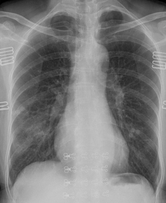
The result of executing the above code for sample COVID-19 images is shared below.
img_path1 ="/content/drive/MyDrive/COVID_IEEE/covid/38_A.jpg"
display(Image(img_path1))
img1 = image_preprocess(img_path1)
last_conv_layer_name = "block_16_depthwise"
heatmap = make_gradcam_heatmap(img1, model, last_conv_layer_name)
save_and_display_gradcam(img_path1, heatmap)
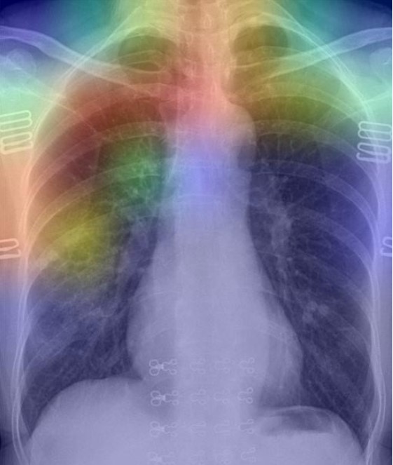
As per the GRAD-CAM heatmap plotted for the COVID-19 image, the model accurately highlighted peripheral left mid to lower lung opacities and ground glass opacity (generally visible in chest CT) in COVID-19.
Conclusion
So, in this article, we have shown the step-wise development of a transfer learning-based MobileNet V2 model for detecting COVID-19 and Viral Pneumonia cases. Further, we have evaluated the model and found its accuracy is around 95.88% with higher sensitivity of 98% for COVID-19 cases and whereas lower sensitivity of 93% for Viral Pneumonia cases. In addition, we have plotted the ROC-AUC curve and found that the model’s AUC value is 1.0 for both Normal and COVID-19 classes whereas 0.99 for the Viral Pneumonia class. At last, we have plotted the GRAD-CAM heatmap for a COVID-19 image and explained the reason for highlighting specific regions in the image.
Thank you for reading! Feel free to share your thoughts and ideas.